Kaikan Sake Bar
Brand Identity, Packaging Design
A weekly design brief from @brand.brief on Instagram.
The Brief
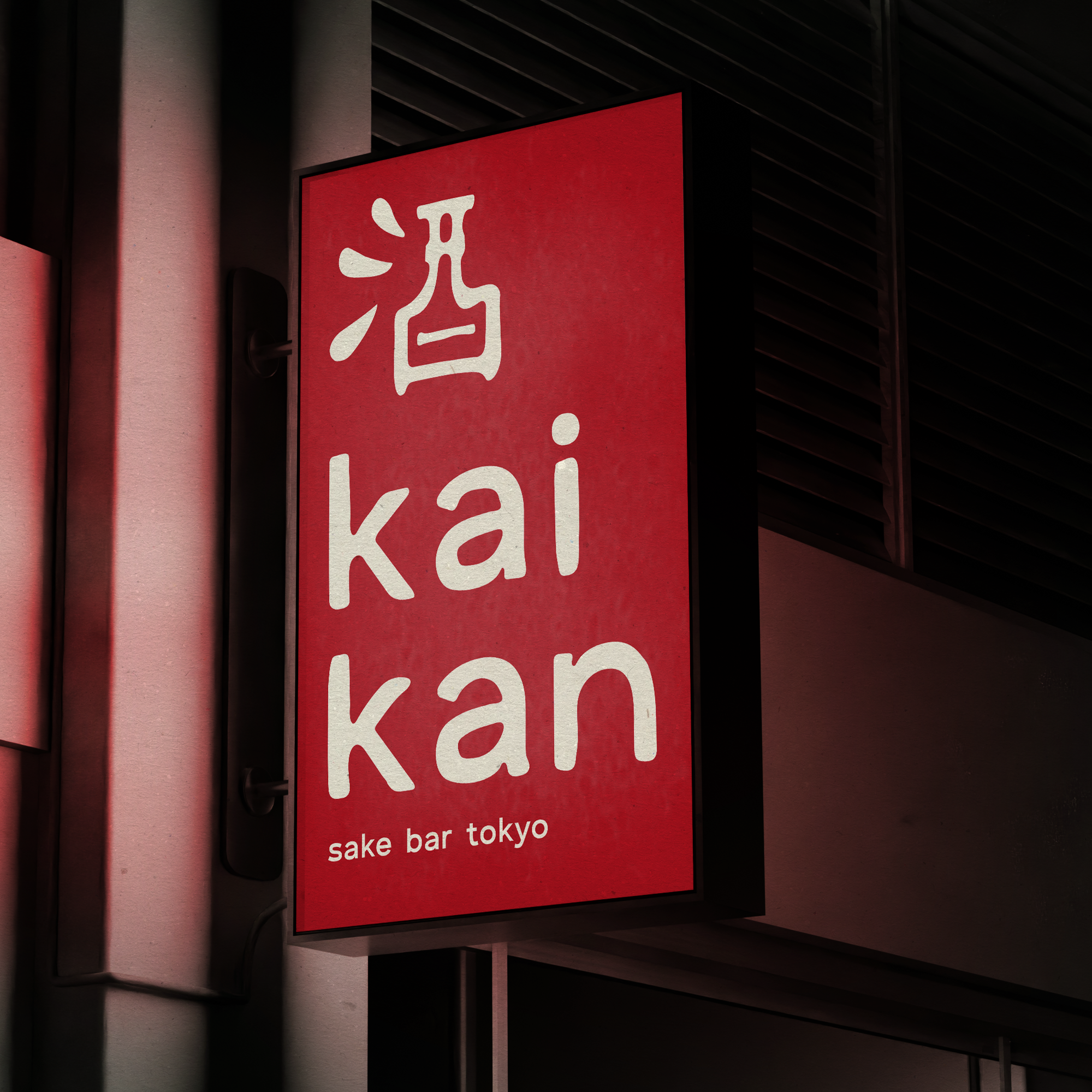
Kaikan is a new sake bar in Tokyo that offers a modern interpretation of traditional Japanese drinking culture. The bar aims to create an inviting atmosphere where guests can enjoy a diverse selection of sake in a stylish setting.
Deliverables
Brand Identity, Sake Menu
Strategy
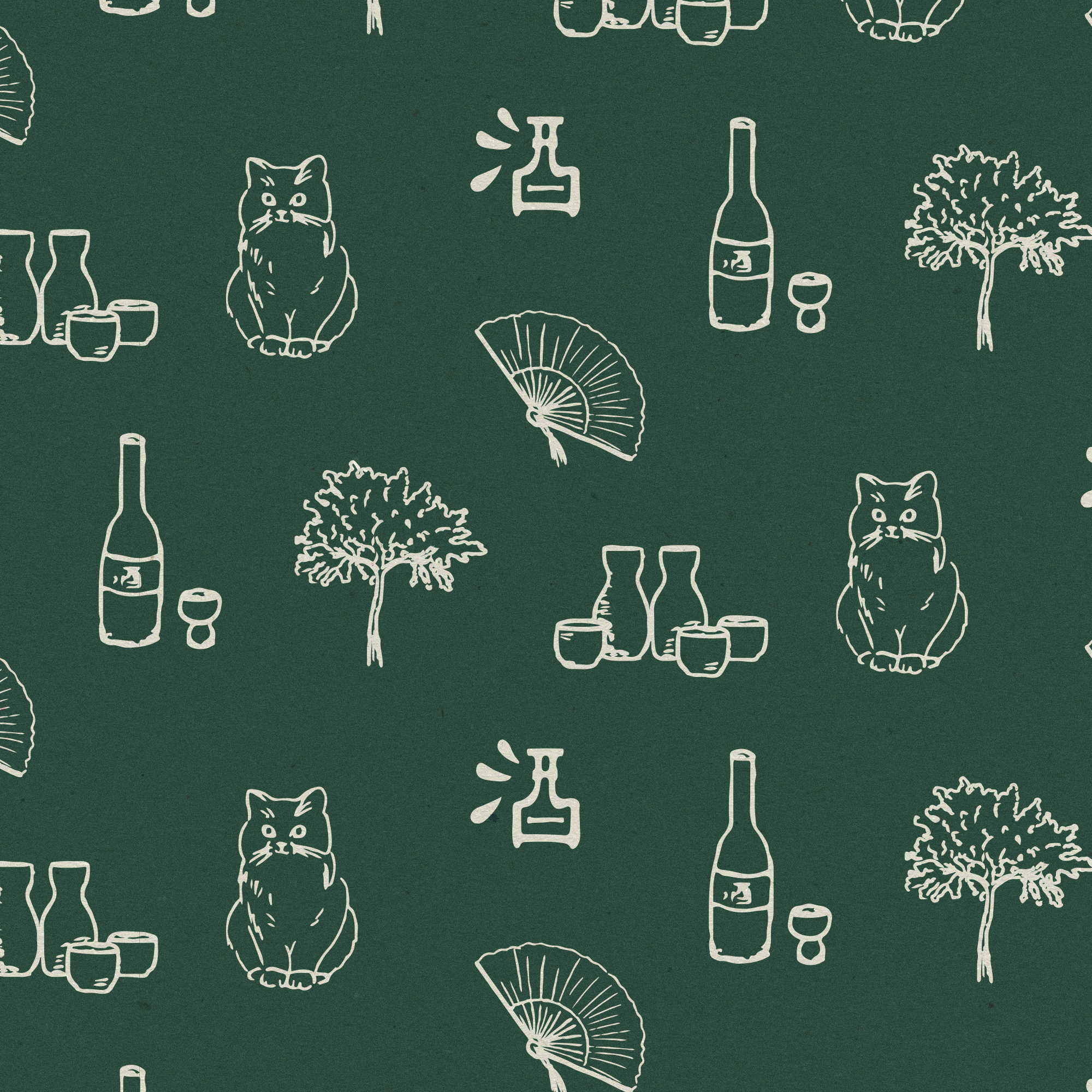
Kaikan's branding blends traditional Japanese culture with a modern, minimalist aesthetic. The logo—a sake bottle crafted from the Japanese character for "sake"—anchors the identity with cultural authenticity and innovation. A clean sans-serif font, paired with slightly distressed typography in the main logo, adds a subtle, handwritten feel that reflects craftsmanship and tradition. The use of iconic cultural imagery, such as a fan, cherry blossom tree, cat, and sake bottles, enriches the brand story, while ample white space ensures a minimalist and contemporary design. The red, green, and off-white color palette ties the elements together, creating a fresh yet timeless reinterpretation of Japanese drinking culture that the brief specified.


